You’ve visualized your data with Matplotlib, and now you want to include your figures in your paper, presentation, website, or other document. However, exporting your figure from Matplotlib is not always trivial if you want to ensure high quality — a look at the plt.savefig() function shows there are over a dozen arguments you can tweak when saving your figures. In this post, I’ll focus on one small aspect of this problem, namely, how to choose the correct file format for saving your figure. For a quick summary of the tips in this article, see the Conclusion.
Update (May 30, 2022): To clarify, this article only reviews the common formats I am familiar with. For a full list of file formats supported by Matplotlib, see here.
Setup 
In this post, we’ll use the following code, adapted from this Matplotlib scatter plot example. This code should work as long as you have numpy and matplotlib installed.
"""Example of saving a scatterplot to different image formats.

Adapted from
https://matplotlib.org/stable/gallery/shapes_and_collections/scatter.html#sphx-glr-gallery-shapes-and-collections-scatter-py
"""
import matplotlib.pyplot as plt
import numpy as np

# Fixing random state for reproducibility
np.random.seed(19680801)

N = 100
x = np.random.rand(N)
y = np.random.rand(N)
colors = np.random.rand(N)
area = (30 * np.random.rand(N))**2  # 0 to 15 point radii

plt.scatter(x, y, s=area, c=colors, alpha=0.5)
plt.tight_layout()

# Save to various formats.
plt.savefig("plot.pdf")
plt.savefig("plot.svg")
plt.savefig("plot.png", dpi=300)
plt.savefig("plot.jpg") # Avoid using JPEGs if possible!This code outputs the following plot in PDF, SVG, PNG, and JPEG formats.

Lesson 1: Prefer vector-based formats 
When exporting figures, the first lesson is to always prefer vector-based image formats. To see why this is, we need to understand the difference between vector and raster graphics. Vector graphics represent images with shapes such as points, lines and curves, while raster graphics represent images with pixels. Importantly, vector graphics have infinite resolution, meaning that you can zoom in and the image will still appear clear, while raster images will become blurry/pixelated. While raster images are excellent for photos of the “real world” (e.g. people and places), most plots consist of points, lines, and curves, making vector graphics the ideal format.

In practice, there are two vector-based formats to stick to. First, if writing a paper with Latex, save your figure as a PDF:
plt.savefig("plot.pdf")Then, include the PDF in your Latex document as follows (assuming you are using the graphicx package). See here for more info about Latex and figures.
\begin{figure}
  \includegraphics[width=\linewidth]{plot.pdf}
  \caption{My awesome plot.}
  \label{fig:plot}
\end{figure}Second, if you are creating your figure for a website, save it as an SVG:
plt.savefig("plot.svg")Then, include the SVG with an img tag, e.g.
<img src="plot.svg" alt="My awesome plot" />With these two formats, your plots will remain crisp and clear when your audience needs to zoom in :)
Several notes regarding SVGs and PDFs:
- Fonts: Both PDFs and SVGs will be fully independent in terms of fonts, i.e. if you use font X in your plot, you will not need to have font X installed on your system when you open the PDF or SVG version of the plot. This is because for PDF, all necessary fonts are embedded in the PDF during export, and for SVG, all text is converted to paths (i.e. lines and curves).
- Embedding SVG directly in HTML: It may be possible to embed the SVG directly in the HTML (i.e. without an
imgtag), but I find that this causes the SVG to always have a fixed size, i.e. even if the screen is small the SVG will not shrink correspondingly. I have yet to find a simple way to make SVGs easily scale their size when directly embedding them.
Lesson 2: When raster-based formats are necessary, use PNG 
In some cases, you will find it necessary to use a raster-based format because a vector-based format is not feasible. For example, many web-based tools (e.g. Google Docs, Google Slides) prohibit SVGs because SVGs may contain malicious CSS and JavaScript. Furthermore, such tools do not accept PDFs because PDFs are technically not images. In such cases, it is necessary to save the image in a raster-based format like PNG or JPEG.
When doing so, use PNGs for the highest image quality. The key difference between PNGs and JPEGs lies in how they compress images. While PNGs use lossless compression, which reduces the image size without losing any data, JPEGs use lossy compression, which deletes image data in order to reduce the image size further. This means that plots saved as JPEGs often have compression artifacts, i.e. distortions which occur because the JPEG removed image data when saving. For more information, refer to this comparison between JPEG and PNG.

While raster-based images will not be as crisp as vector-based images, you can compensate for this by increasing the resolution when saving. To do this, pass the DPI (dots per inch) parameter, e.g.
plt.savefig("plot.png", dpi=300)The DPI required will depend on (1) the size of your Matplotlib figure in inches, and (2) the size of the image you need in your document. 300 DPI is usually sufficient, though you will need to go higher if your image is larger in the final document than in Matplotlib (e.g. if it is 8in. x 6in. in the final document but only 4in. x 3in. in Matplotlib).
Alternative Formats 
Finally, here are some alternative image formats:
- PGF: Matplotlib supports saving images as a PGF file, which is a set of commands that can be parsed by the Latex pgf package to create figures directly in a Latex document. I have not used this format because it requires having Latex installed on the system where I am plotting, and PDFs are already sufficient for my purposes. For more information on saving to PGF, see here.
- TIFF: TIFFs are a raster-based format typically used in print applications. Since I spend most of my time working with the web, I am more familiar with PNGs. For a comparison between PNGs and TIFFs, see here.
Conclusion 
While it may be sufficient to save all your Matplotlib figures in one format, choosing the right format can make your figures clearer and more professional. This article introduces several guidelines for choosing the right format, which may be summarized by the following table.
| Where will you use your figure? | You should save your figure in this format: |
|---|---|
| Latex document (e.g. a paper or report) | |
| Website | SVG |
| Web-based tool (e.g. Google Docs, Google Slides) | SVG if allowed, PNG otherwise |
| Word processor (e.g. Microsoft Word) | SVG if allowed, PNG otherwise |
Bonus Tips 
TrueType Fonts 
Many venues require that your paper use Type 1 / TrueType fonts, but Matplotlib uses Type 3 fonts by default. To make sure you use TrueType fonts when exporting your figures to PDF, use the following code:
import matplotlib
matplotlib.rcParams['pdf.fonttype'] = 42
matplotlib.rcParams['ps.fonttype'] = 42See this blog post for more info.
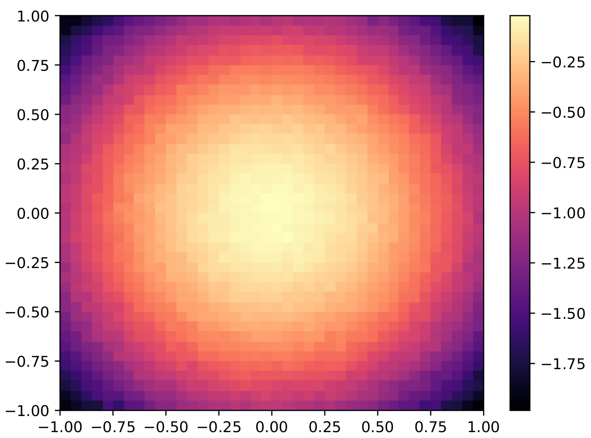
Heatmaps 
When saving heatmaps e.g. those generated by Seaborn’s heatmap() or Matplotlib’s pcolormesh(), you may find that the PDF shows thin white lines between the cells, even if you did not specify any borders around the heatmap cells. This occurs because the PDF viewer is struggling to render the large number of independent cell objects.
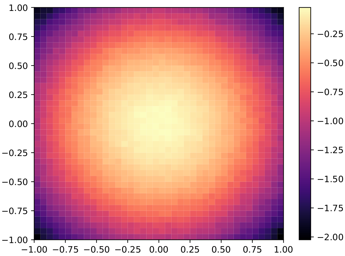
To resolve this issue, rasterize the heatmap cells by passing rasterized=True to heatmap() or pcolormesh(), i.e.
sns.heatmap(..., rasterized=True)
plt.pcolormeash(..., rasterized=True)This will convert the cells of the heatmap (but not the rest of the plot) into a single image which can easily be rendered. See this StackOverflow question for more info.